THE BELL
—
A Taco Bell Hotel & Resort
A Taco Bell Hotel & Resort
THE BELL • A TACO BELL HOTEL & RESORT
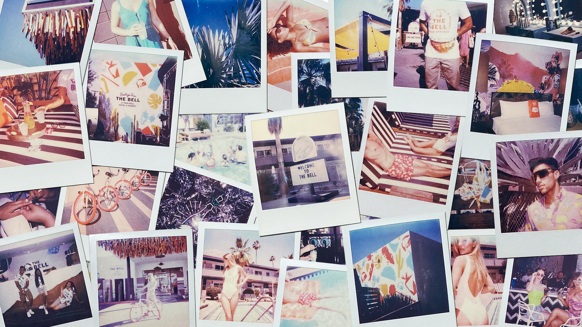
In August of 2019, Taco Bell launched the biggest expression of the brand in it’s history—The Bell: A Taco Bell Hotel & Resort. I developed the brand identity and visual direction for this four day experience.
In August of 2019, Taco Bell launched the biggest expression of the brand in it’s history—The Bell: A Taco Bell Hotel & Resort. I developed the brand identity and visual direction for this four day experience.
CREDITS
Jennifer Arnoldt, Chris Ayres, Jess Kirkman, Renee Bones
ROLE
Brand Identity
Art Direction
Jennifer Arnoldt, Chris Ayres, Jess Kirkman, Renee Bones
ROLE
Brand Identity
Art Direction
2019

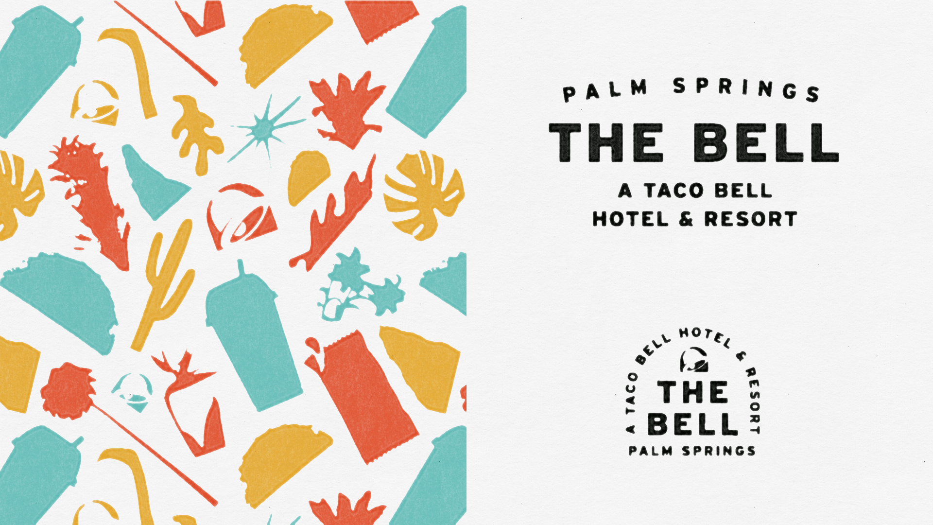
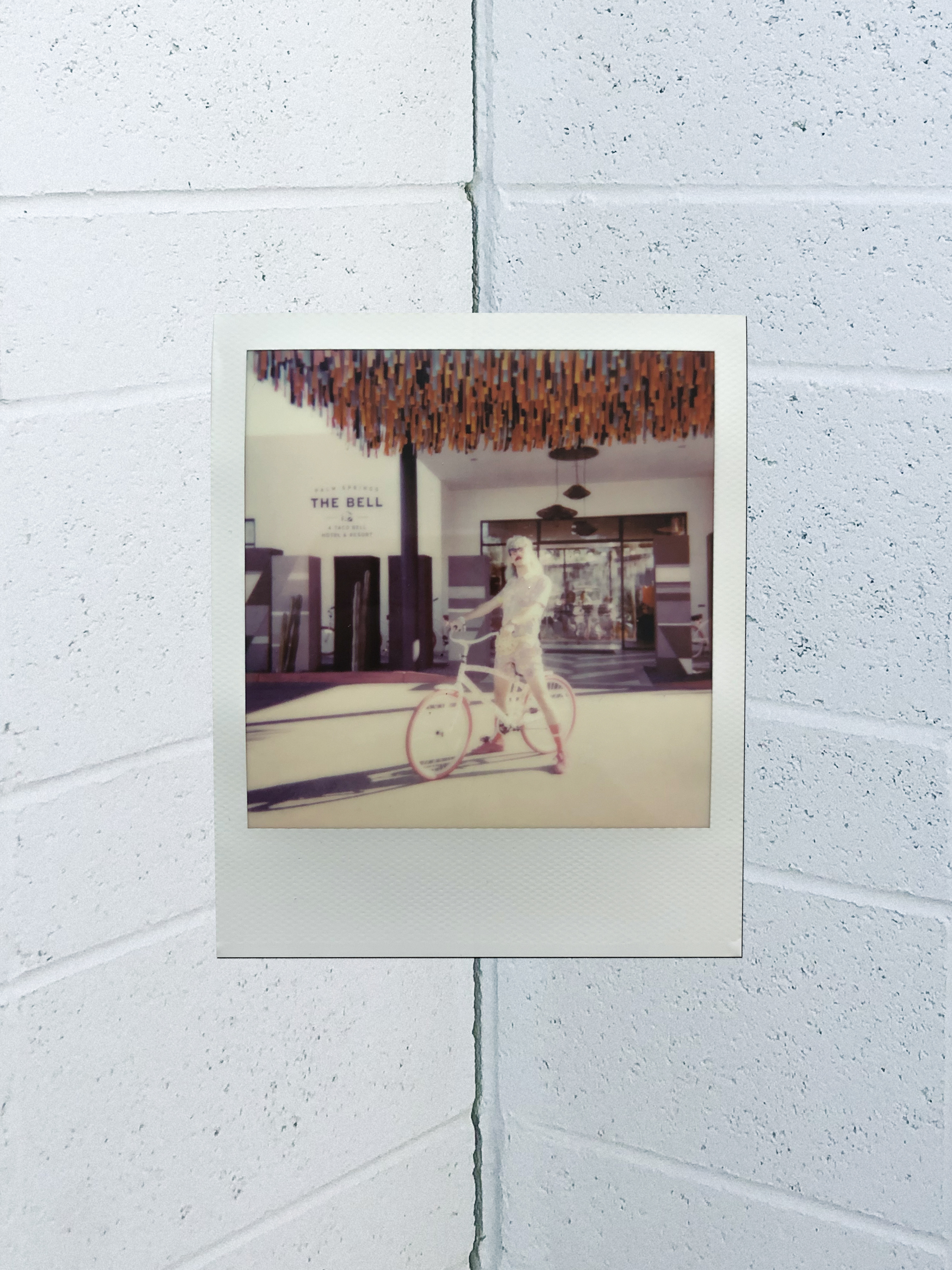
The Brand
It was important to make sure this new extension and experience of Taco Bell still felt ownable to the brand—and with a Palm Springs location as inspiration, it was easy to go overboard in exploration. We chose typographic driven identity with a suite of submarks that could work for any given application. We utilized a colorful pattern to infuse a playful wink when necessary.
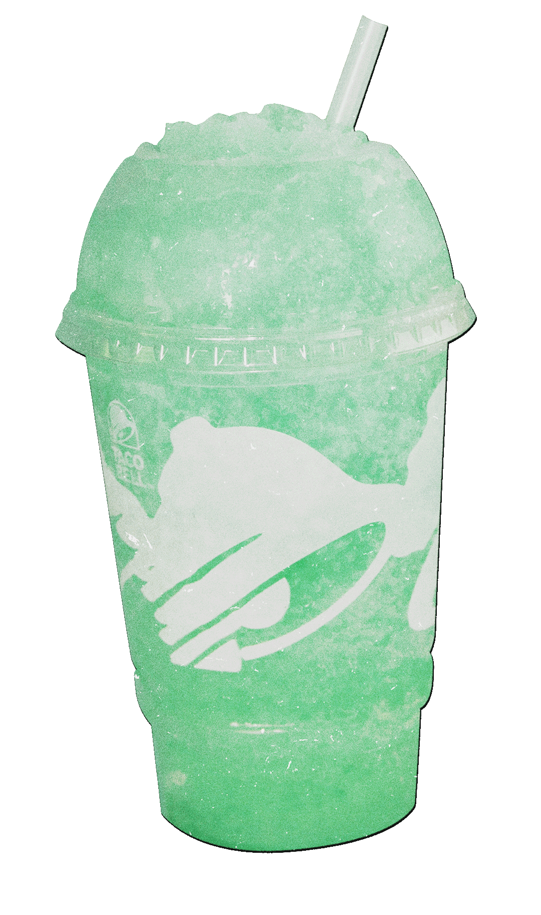
The hard taco shell, fire sauce, and Baja Blast inspired color palette felt perfectly at home in a Palm Springs environment.
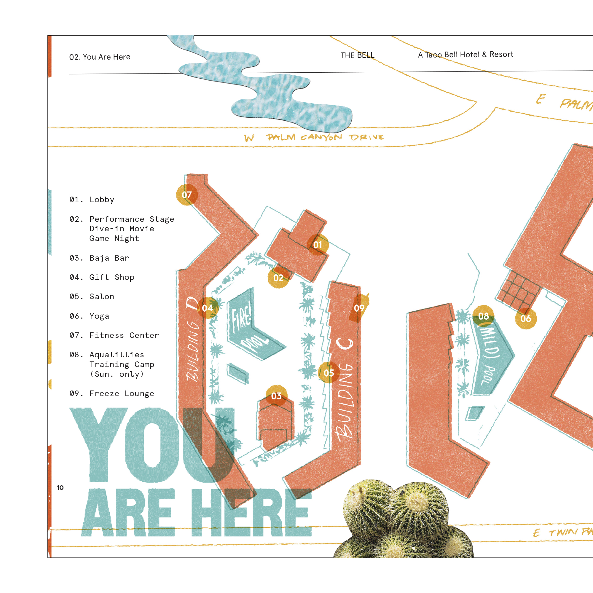
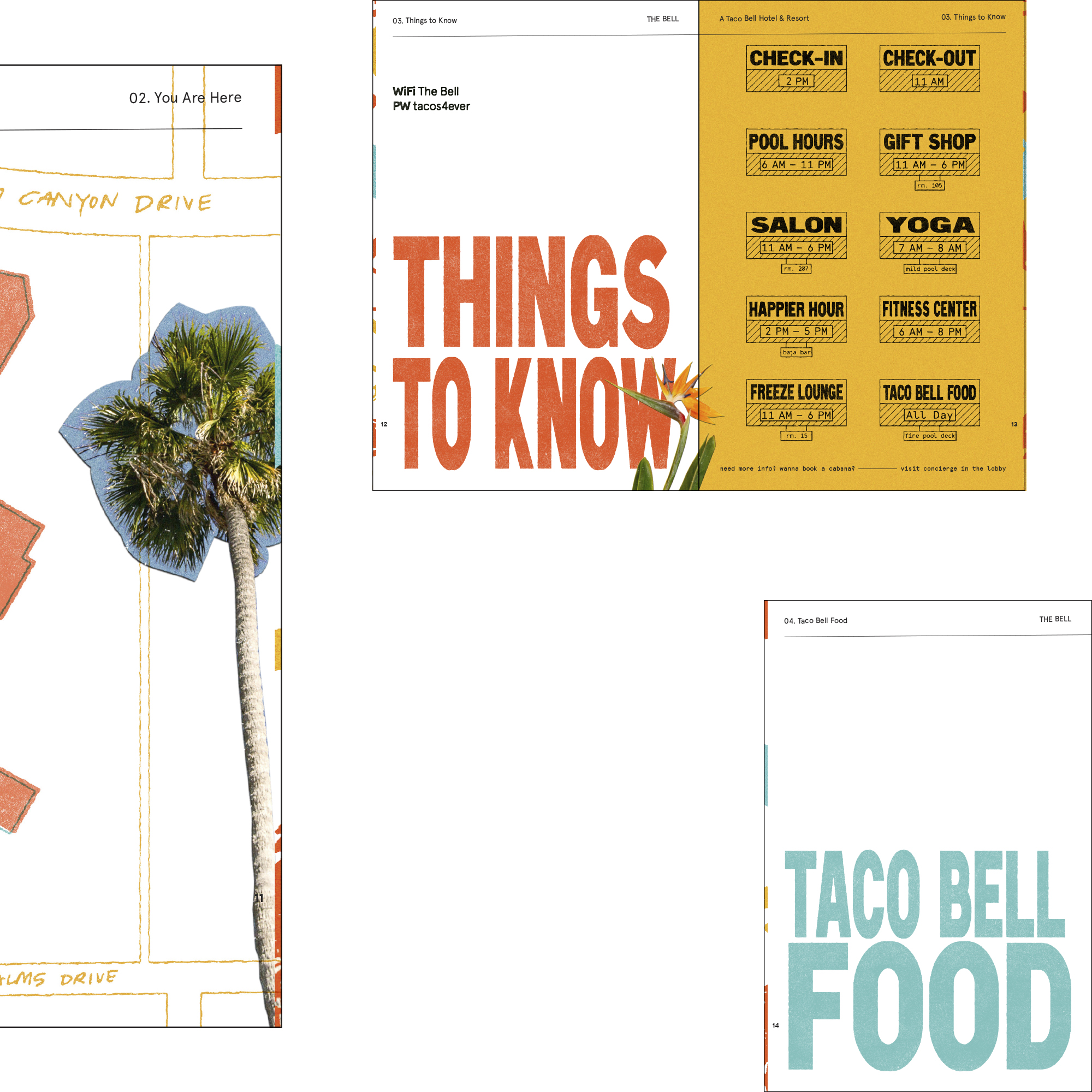
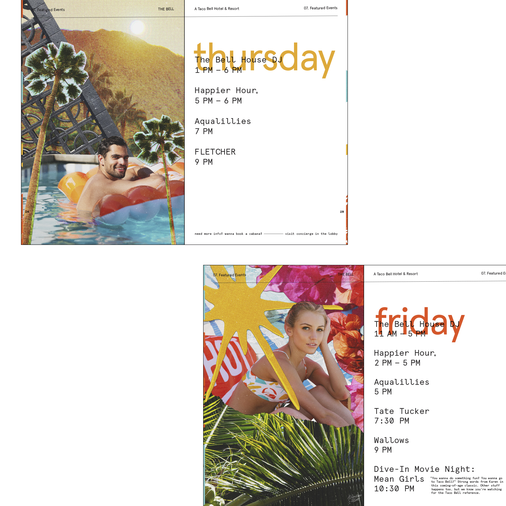
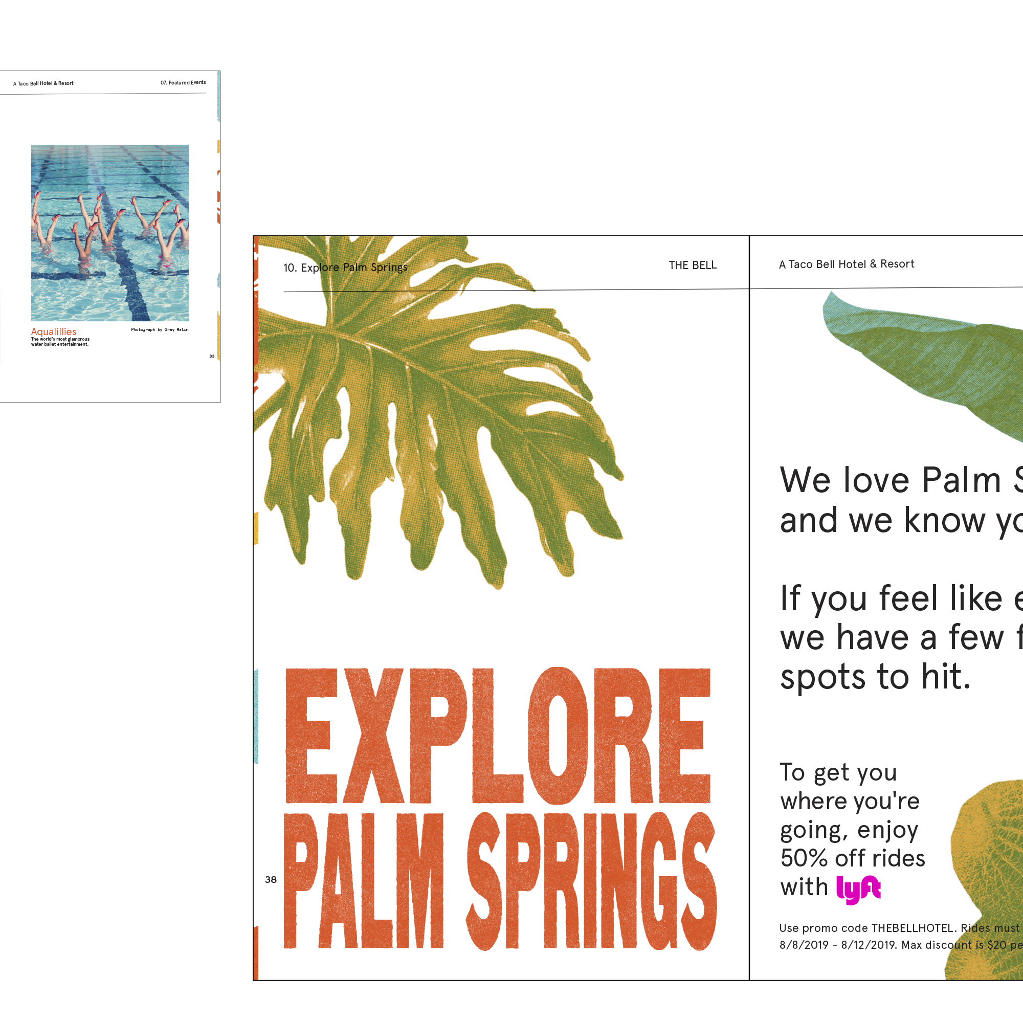
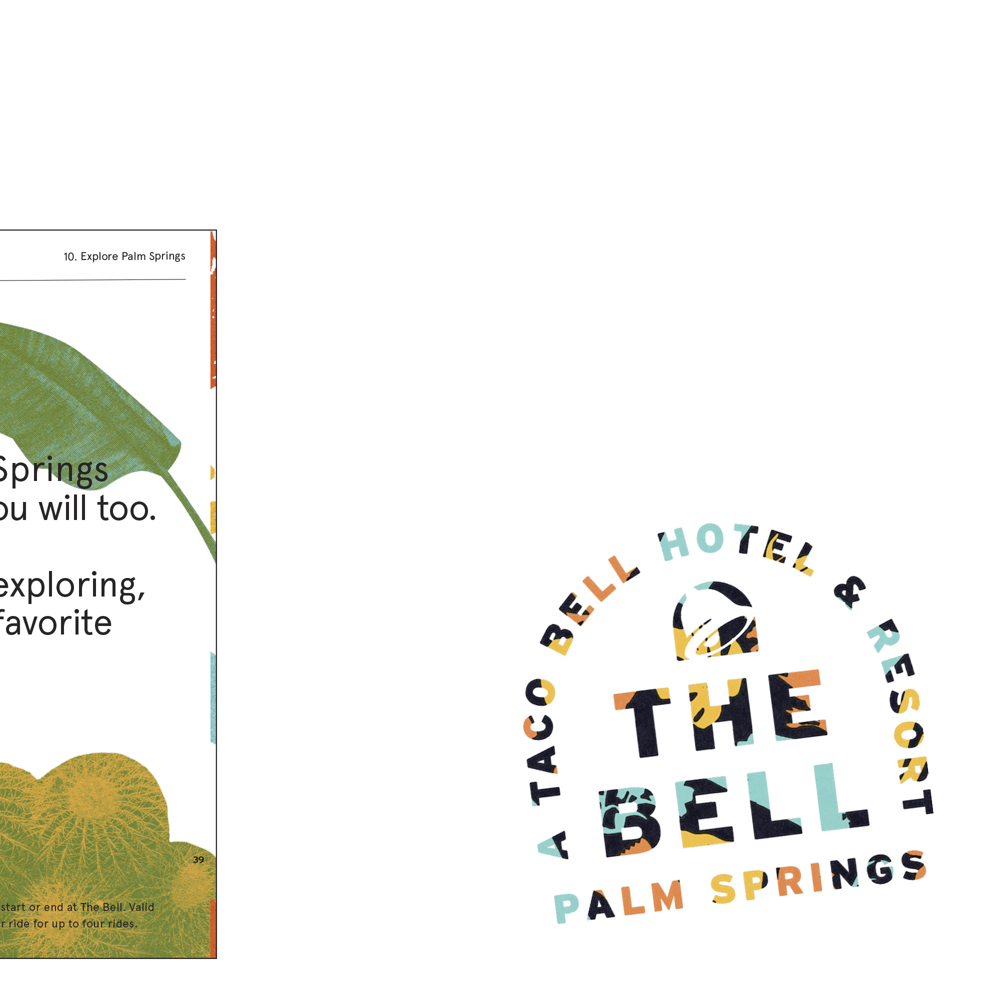
In effort to center the guest at the entirety of the experience, we developed a Welcome Guide containing all of the information they needed for their stay.
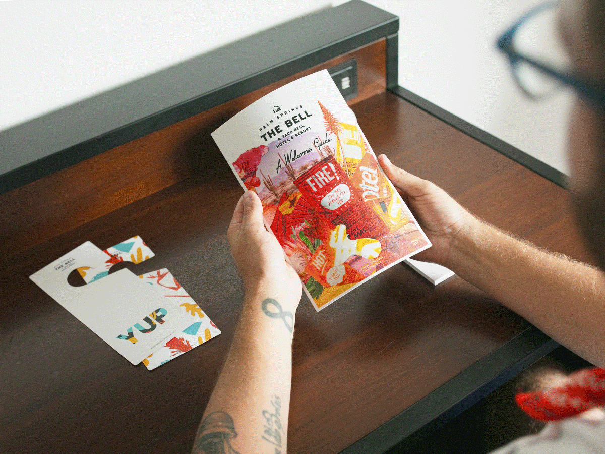
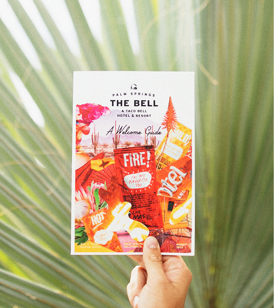
The Guide
Creating the Welcome Guide served as a playground for how to express and explore The Bell’s identity.
Because this information-heavy guide needed to serve functionally, we leveraged a typographic system that allowed information to be quickly leglible while breaking some rules to add some Taco Bell fun throughout.
Leveraging an eclective typographic system, the information-heavy guide had to remain Maintaining a bit of reBellious edge through an eclectic typographic system, mixed media art, digital and analog elements, with a pinch of witty copy.


︎
A look at some of the spreads
A look at some of the spreads


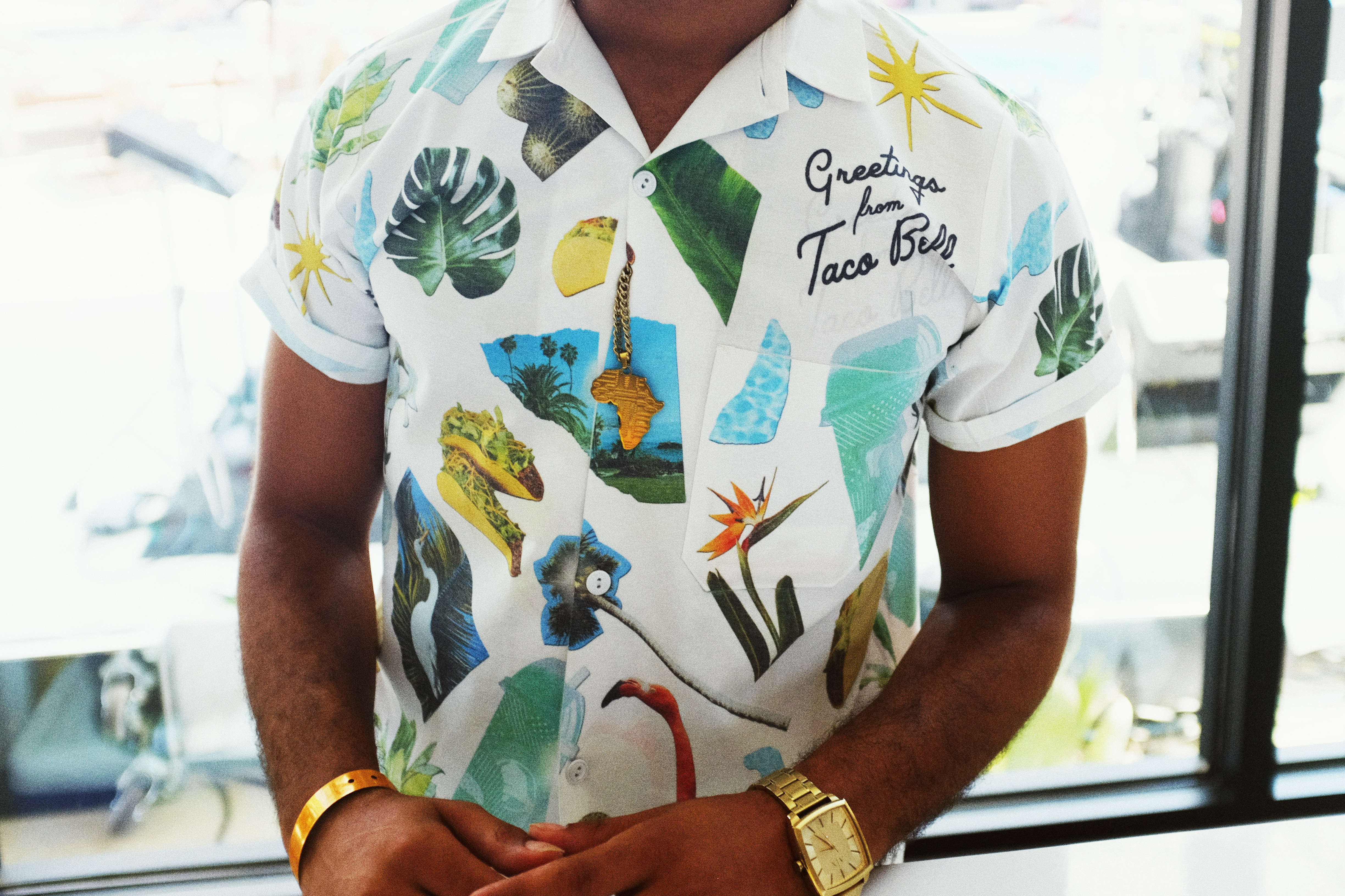
A series of branded collages were crafted and utilized as murals in the bedrooms, applied to ephemera, and deconscructed and used as pattern for uniforms.

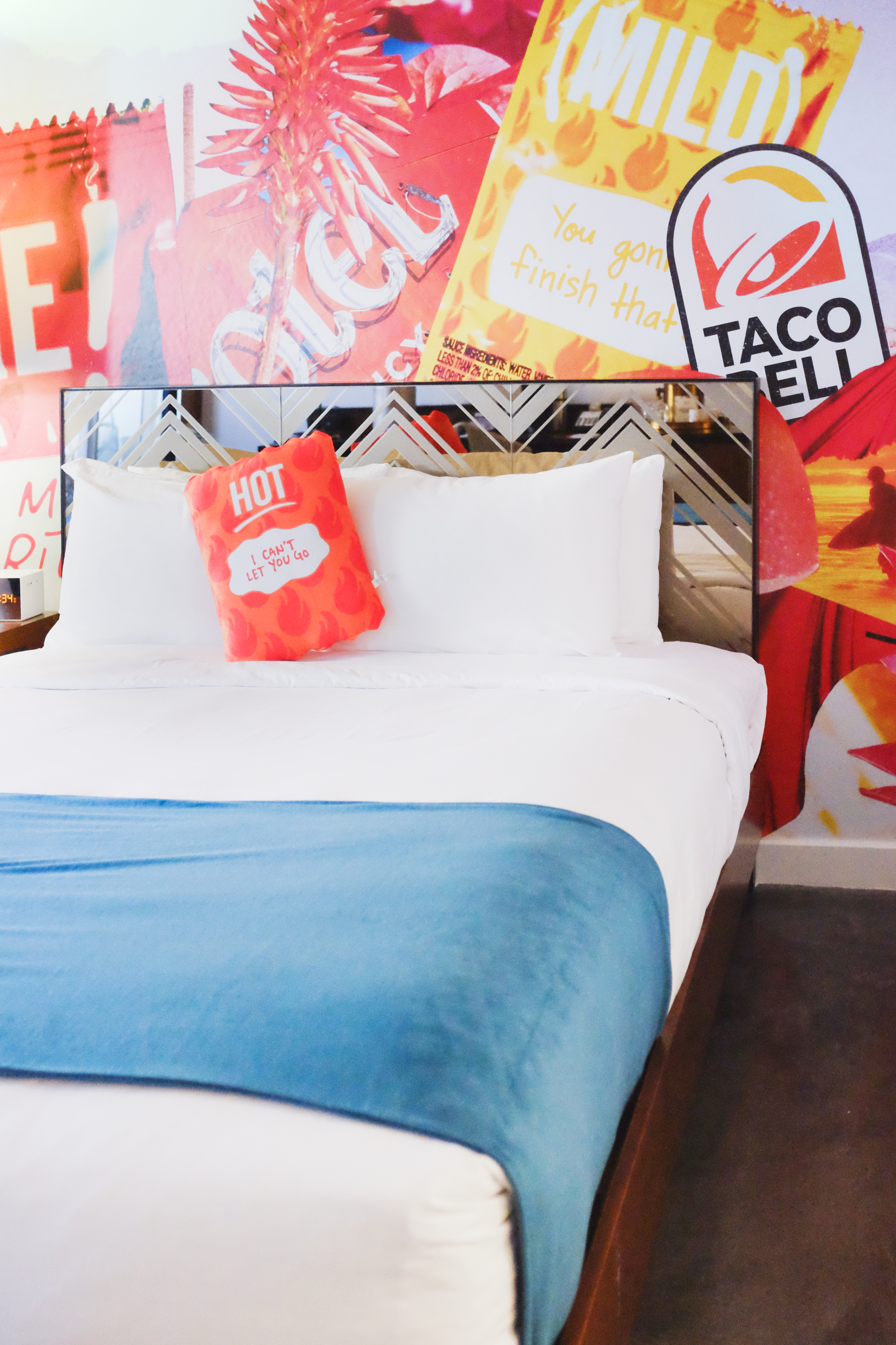
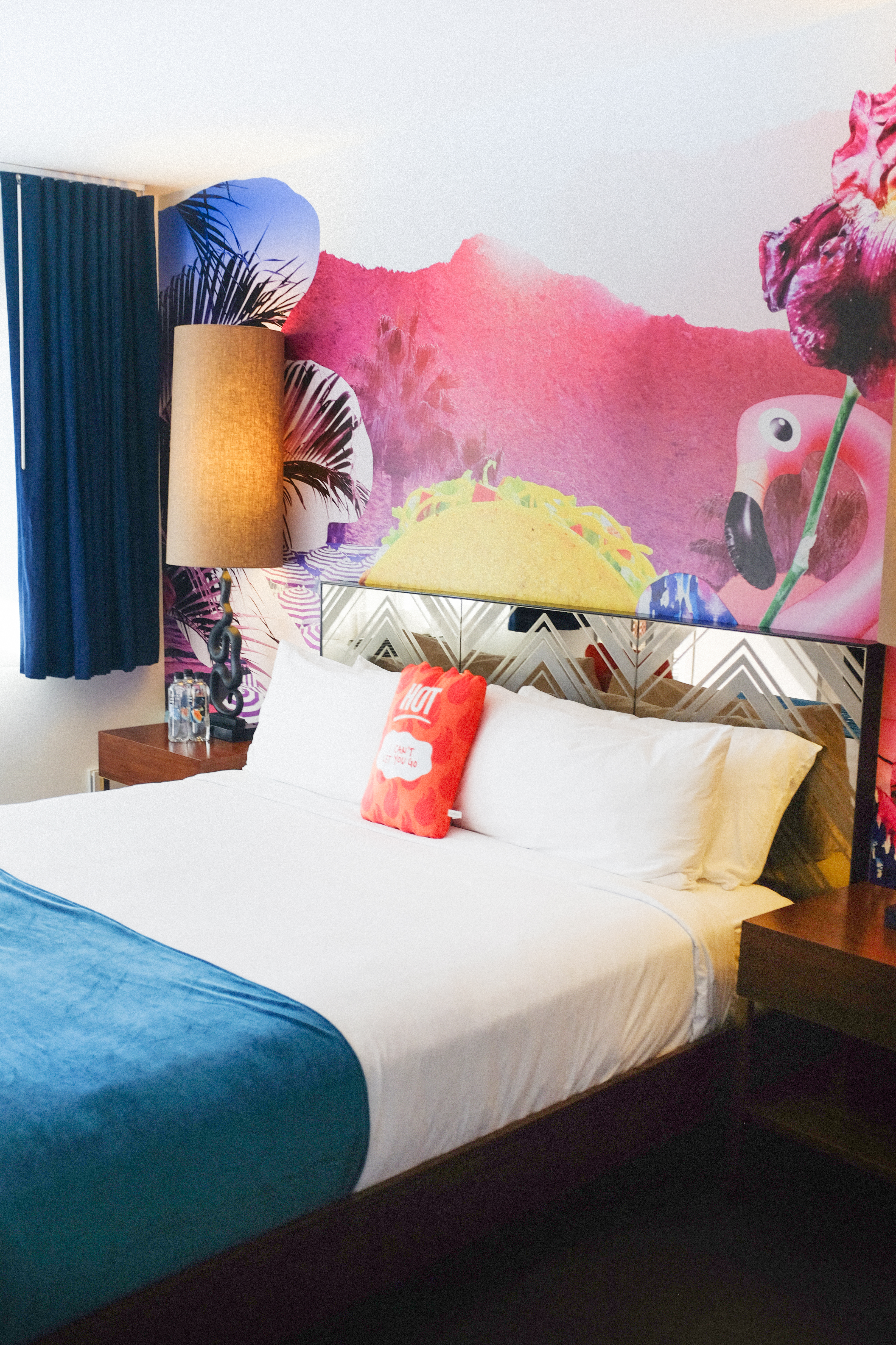
Each collage was translated to a repeating pattern mural for the bedrooms—immediately immersing the guest into the colorful world of The Bell.