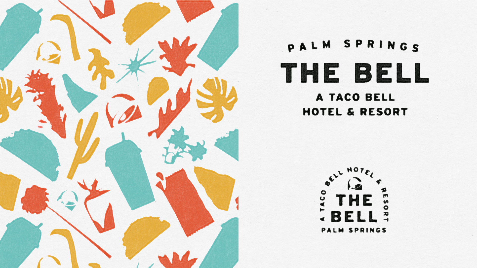
BRANDING
Palm Springs and it’s desert heat made for a lovely inspiration point when developing the brand.I wanted to inject Taco Bell into Palm Springs, not vice versa. Given the destination, it would have been easy to lean towards a direction that might be a bit on the nose. We chose a typographic driven identity with a suite of submarks that could be used on any given application—inspired by retro travel (stamps, luggage tags, posters, etc.)
The color palette was lifted from our iconic food:
Crunchy Taco Shells, Sauce Packets, and Baja Blast.

It was important
to keep the guest
at the center of
the experience
—
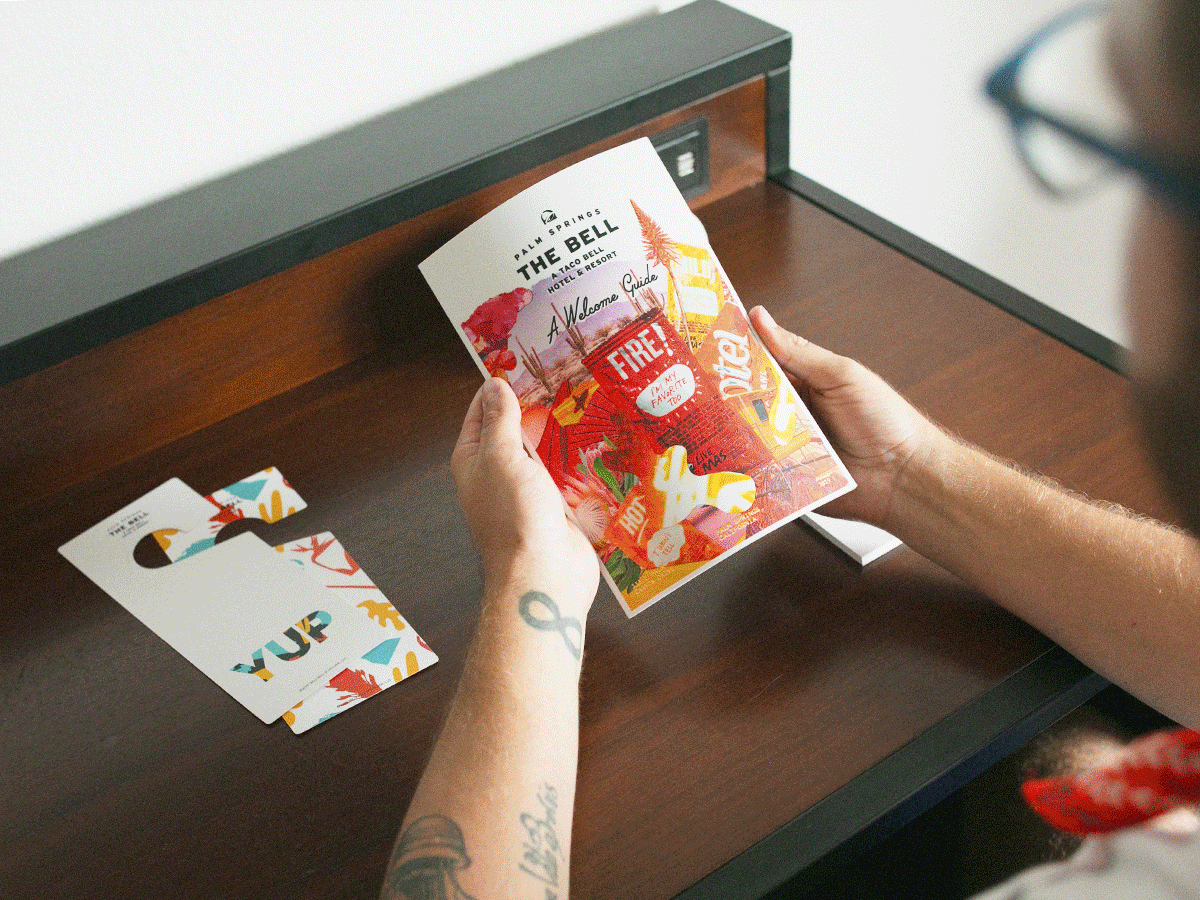
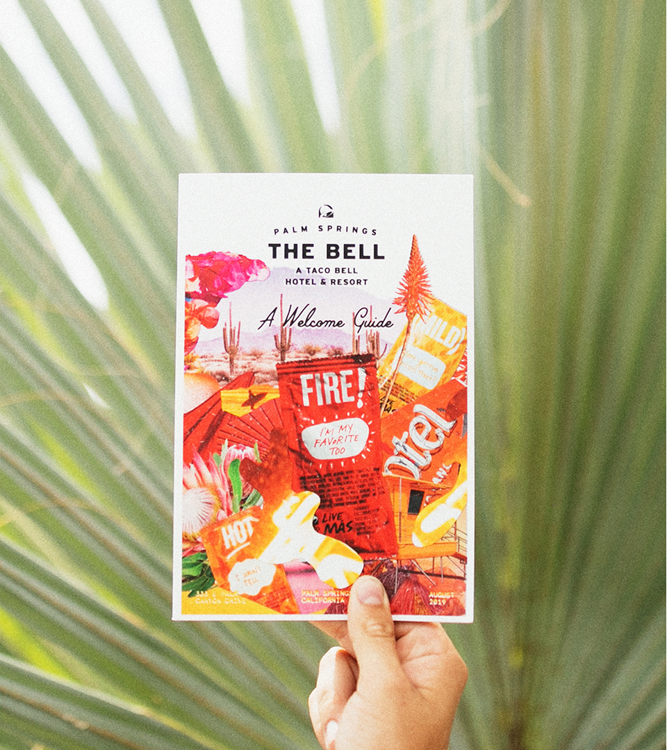
I wanted to rethink how we would communicate with our guests about what to expect—and there were many surprise & delights they were not made aware of prior to arrival. to incorporate something tangible for these super fans to take a way from their experience.
We developed this Welcome Guide zine to be functional yet beautiful enough that you could proudly display on your coffee table.